If all As are Bs, And all Bs are Cs, Then, all As are Cs..
Considering “practice makes perfect” is a popular cliché for human being in general, Aristotle syllogism above is particularly common for logic and analytical students. (right? 😶)
In fact, Aristotle one of the greatest philosophers of all time and his teacher, Plato are regarded as the most notable historical figures in the world, according to Project Pantheon dataset that I am playing around with today.(https://www.kaggle.com/mit/pantheon-project)
This interesting dataset was introduced by MIT Media Lab as an attempt to quantify culture accomplishments that endow our species and shape our world like it is today. Ultimately, Pantheon identifies and classifies famous historical figures via weighing upon Wikipedia pageview and editions, breaking down by cultural domains, languages, geographies and time period. Then, a composite Historical Popularity Index will be calculated.
To follow through, you can either download the data from kaggle (https://www.kaggle.com/mit/pantheon-project) or simply read_csv using below code:
pantheon_popularity_index <- read.csv("https://raw.githubusercontent.com/Rachelios/A-cup-of-tea-and-a-good-book/master/pantheon_popularity/pantheon_database.csv", stringsAsFactors=FALSE)

print(head(pantheon_popularity_index,5))
First few rows in the dataset: 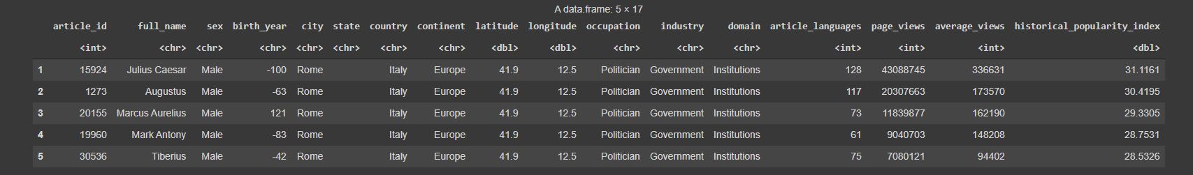
Key Cultural Domains
To deepen our understanding on the dataset, I sorted and selected 6 highest-ranked city by influence dominance according to the index, and placed a filter on the influencers whose Wikipedia profiles have been written in more than 30 languages to constraint and ensure importance level.
pantheon_i30 <- pantheon_popularity_index %>%
  filter(city %in% c('Rome', 'Paris', 'New York', 'Los Angeles', 'London', 'Tokyo'),
         article_languages>=30) %>%
  mutate(birth_year = (birth_year))
There are 7 key cultural domains:

Around the World
After the polar hclust chart that I’ve inspired to visualise by Hannah Yan , I seem to have an endless preference towards polar charts. (because they look fantastically nice… )
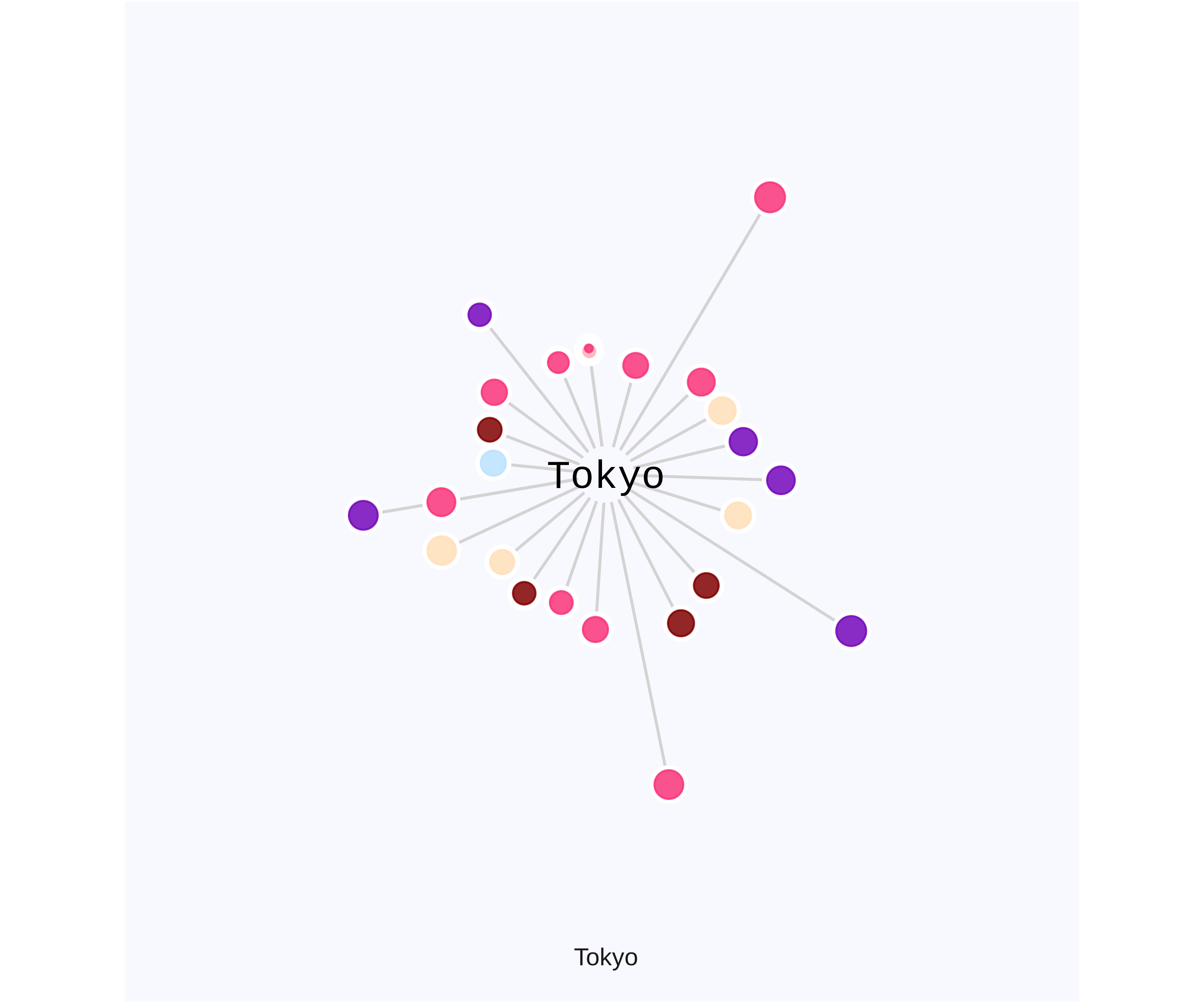
Today I will again plot this popularity index by country in bubble chart, with size of the bubbles indicating the magnitude of popularity index and coordinate them to a single node with the length of the lines indicating number of languages.
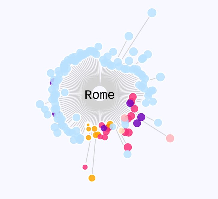
Interestingly, majority of records in Rome are in Institution category, probably due to its many Popes.
 Paris, The City of Lights, in comparison has more influencing figures in Arts and Humanities with notable people such as Voltaire, Louis XIV of France, Claude Monet.
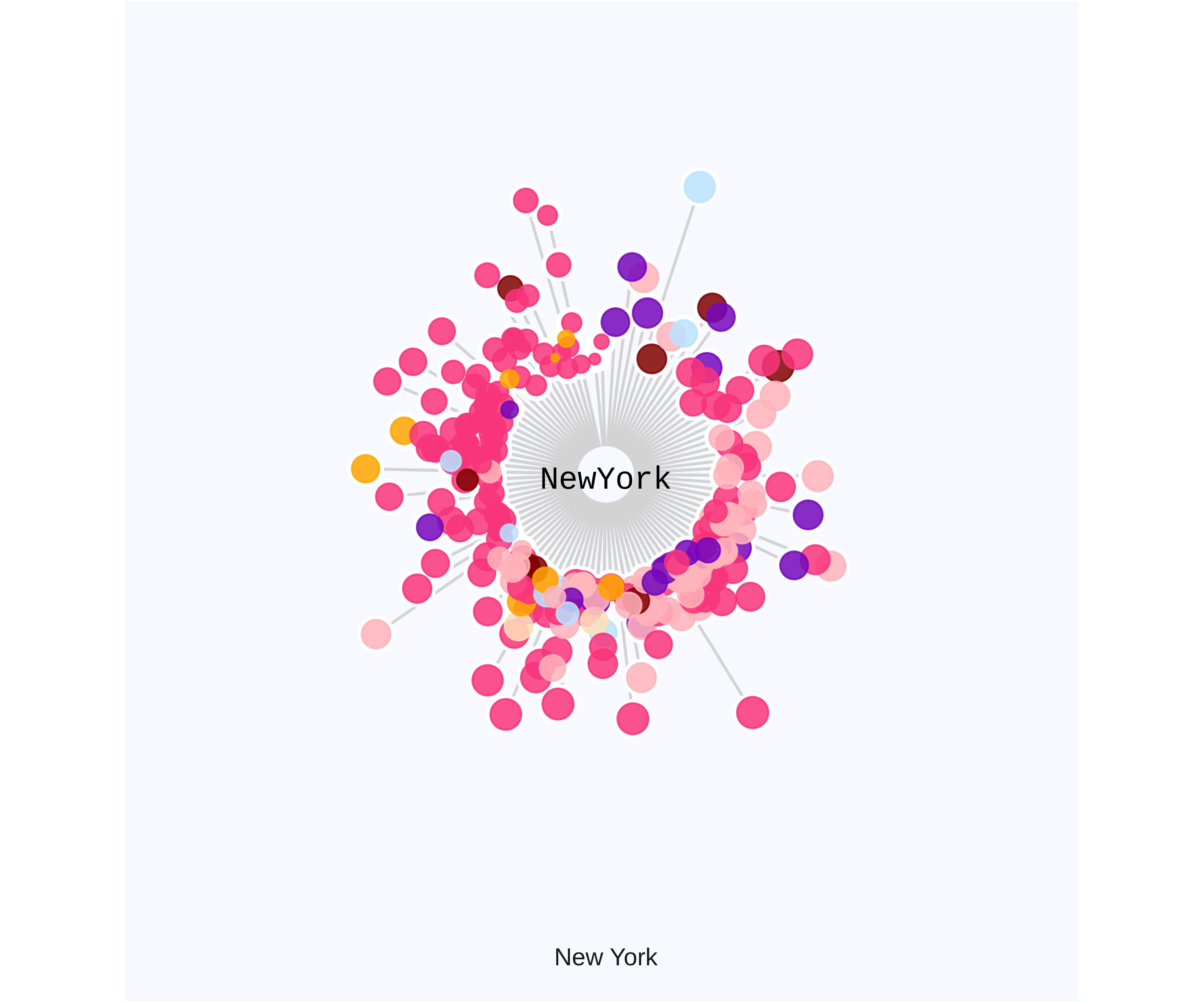
Not so surprised as a cultural diversified city, New York demonstrates cultural influence in all domains, from Humanities to Sports to Science & Technology.
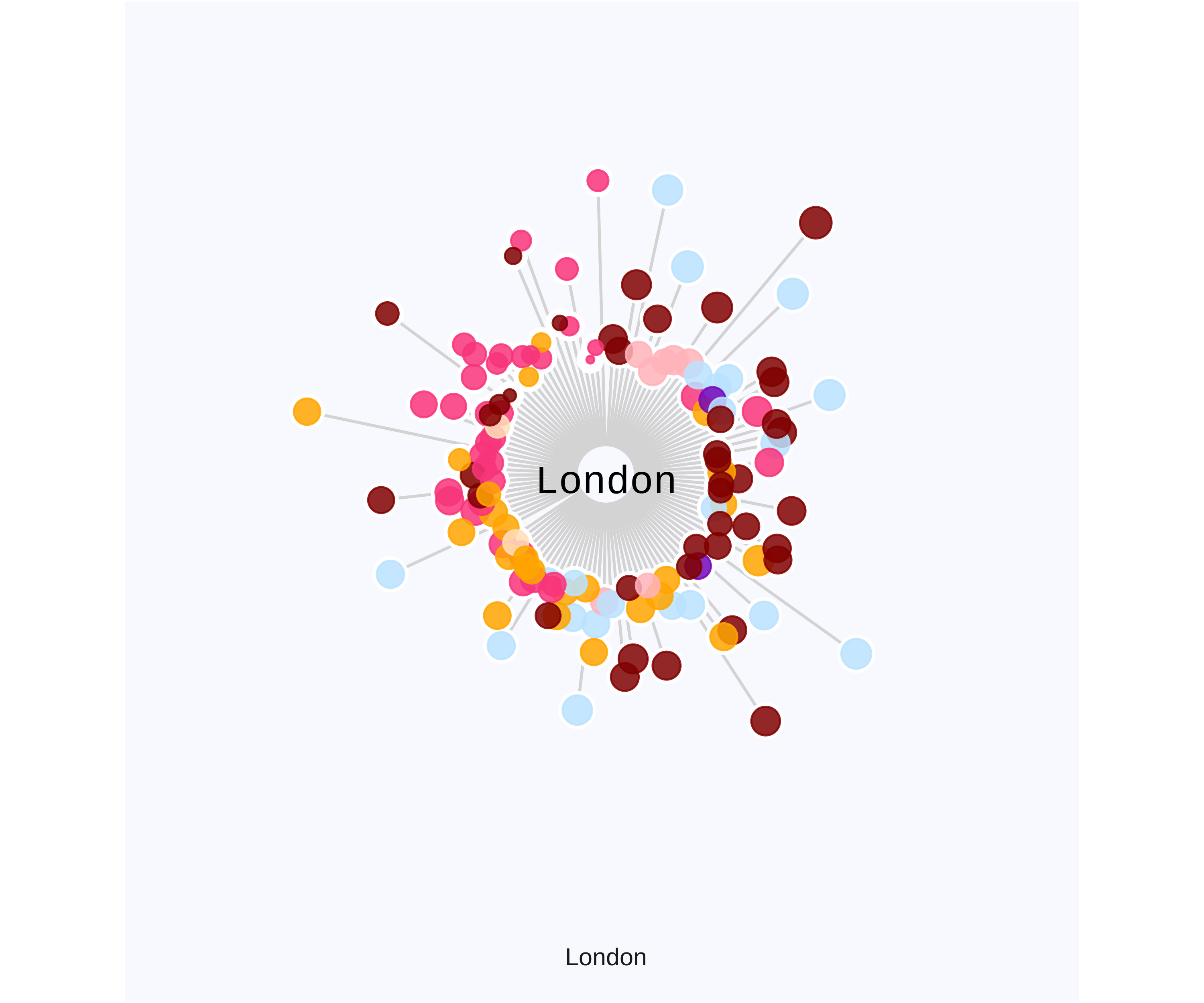
London exerts a quite dominant of influence in Arts and Science and one of the cities with the most notable female figures while Tokyo is the birthplace of historically renowned emperors like Hirohito, Akihito.
The key code that I used to plot: basically ggplot() and coord_polar()
tiff("los angeles.jpg", width = 5, height = 5, units = 'in', res = 500)
pantheon_i30_LA<- pantheon_i30 %>%
  filter(city %in% c('Los Angeles')) %>%
  arrange(desc(historical_popularity_index))

# tiff("Rome.tiff", width = 5, height = 5, units = 'in', res = 500)
 pantheon_i30_LA %>%
  ggplot()  +
  #historical_popularity_index/20
  geom_segment(aes(y = 0,
                   x = birth_year,
                   yend = article_languages,
                   xend =  birth_year),
                   color = "lightgrey", size=0.5) +

  #use marginal border to different gender
  geom_point(aes(x=birth_year,
             y=article_languages,
             size=historical_popularity_index/20 +0.4),

             col="white",inherit.aes = FALSE)  +
  geom_point(aes(x=birth_year,
             y=article_languages,
             col=domain,
             size=historical_popularity_index/20),
             alpha=0.85, inherit.aes = FALSE) +  ylim(-10,120) +
  coord_polar() + facet_grid(.~city,switch="both") +
  #geom_text(aes(label = city), x = 0, y = 0, hjust = 0.5, vjust = 2, size=4.5, fontface = "plain",family = "Poppins") +
  annotate("text", x = 0, y = 0, hjust = 0.5, vjust = 1.5, label="LA", size=6, fontface = "plain",family = "Cinzel",inherit.aes = FALSE) +
  theme_void() +
  my_theme() +
  #geom_text(data=pantheon_i50_rome, aes(x = 0, y = -18, label=city), colour = "black", alpha=0.8, size=4, fontface="bold", inherit.aes = FALSE) +
  scale_color_manual(values=c("#f7347a", "#ffdfba","#7408bb", "#bae1ff", "#800000", "#ffb3ba","#ffa500","#ffa500", "#3b5998"))

dev.off()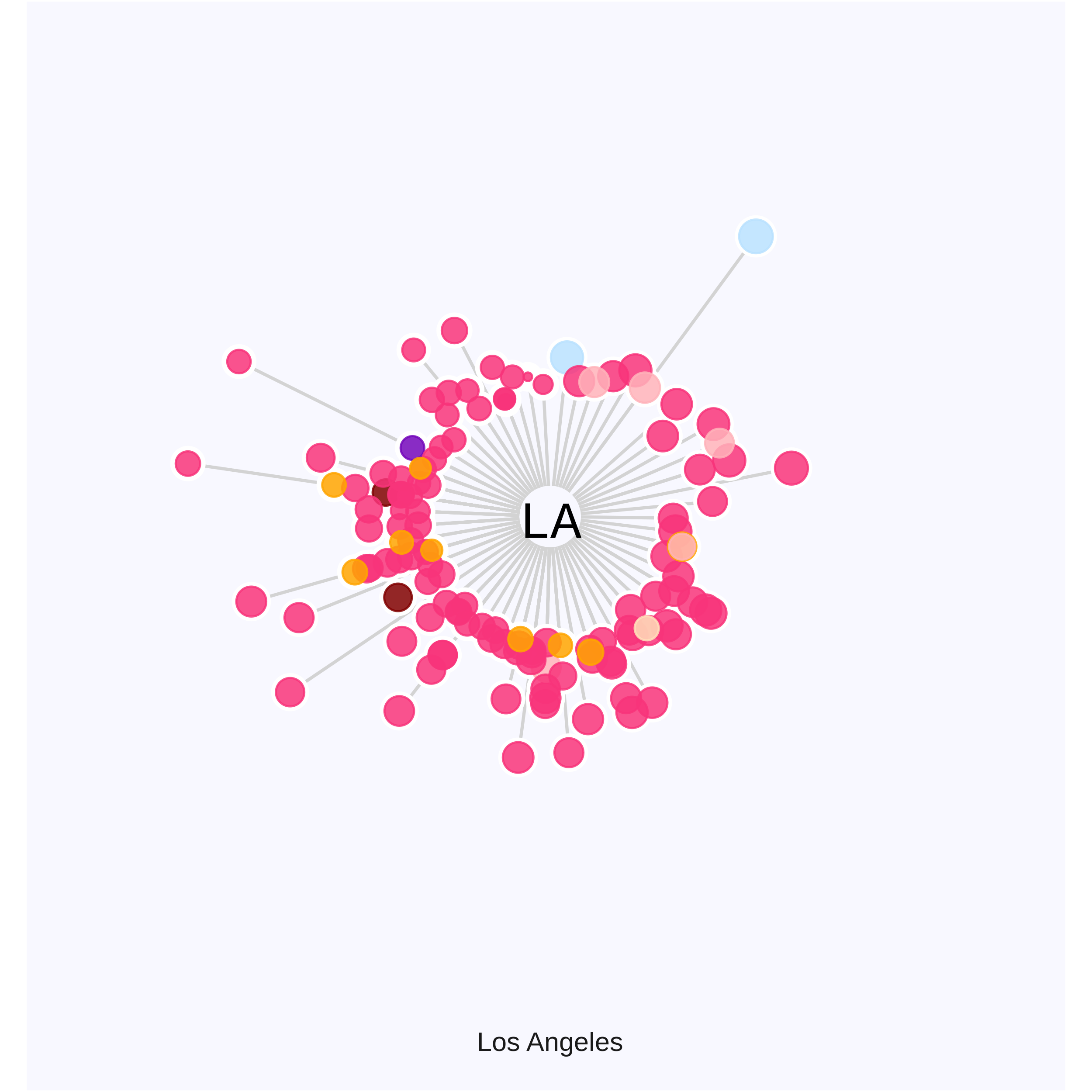
As next steps, it would be good to know how cities and countries have shifted in prominence and which region were the centers of science or arts in history. I would also want to spend time looking into the most latest Pantheon data v2, updated 2020 and revisit above understandings.
----
Thanks for reading! You can find my R markdown code here.